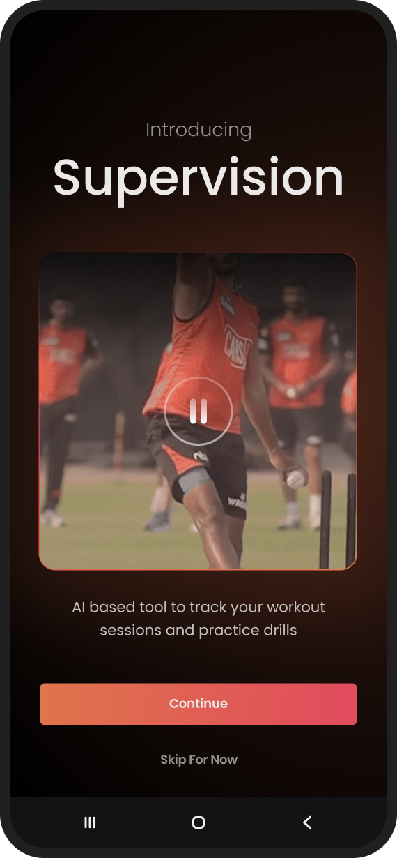
Khiladipro hired me to design every user-facing surface of a first-of-its-kind event: two landing pages, paid registration, app onboarding, and the olympiad itself, in about eight weeks, solo.
Outcome data: Analytics for this project were owned by the client, and I won’t publish numbers I can’t verify. Chapter 06 covers what I would have measured.
Khiladipro is a sports-tech startup whose app uses the phone camera and visual AI to score fitness drills. For the summer vacations, they planned something India hadn’t seen before: a sports & fitness olympiad for students aged 12-18, competed entirely from home. Register, pay an entry fee, receive a kit, complete AI-scored drills on camera, win prizes.
For the business, the olympiad was also an acquisition wedge: a way to reach casual, non-serious users adjacent to their core audience of young athletes. Everything a user would touch, I designed.
The brief & the constraints
The engagement was execution-focused: strategy and success metrics stayed with the client. My first job was to map “design the olympiad” into four concrete surfaces: a landing page that converts, a registration flow that collects payment, an onboarding that teaches the drill ritual, and the in-app event itself, and then design all four inside these constraints:
- C-01An inherited design language, no design system. The app already existed; my screens had to look native to it, with only a little wiggle room.
- C-02A fixed calendar. The event window, 25 May to 15 June, was locked to school vacations, and marketing needed the pages well before that.
- C-03Three audiences, one page. Students compete, parents pay and supervise, academies bring whole cohorts. Each needed a different promise.
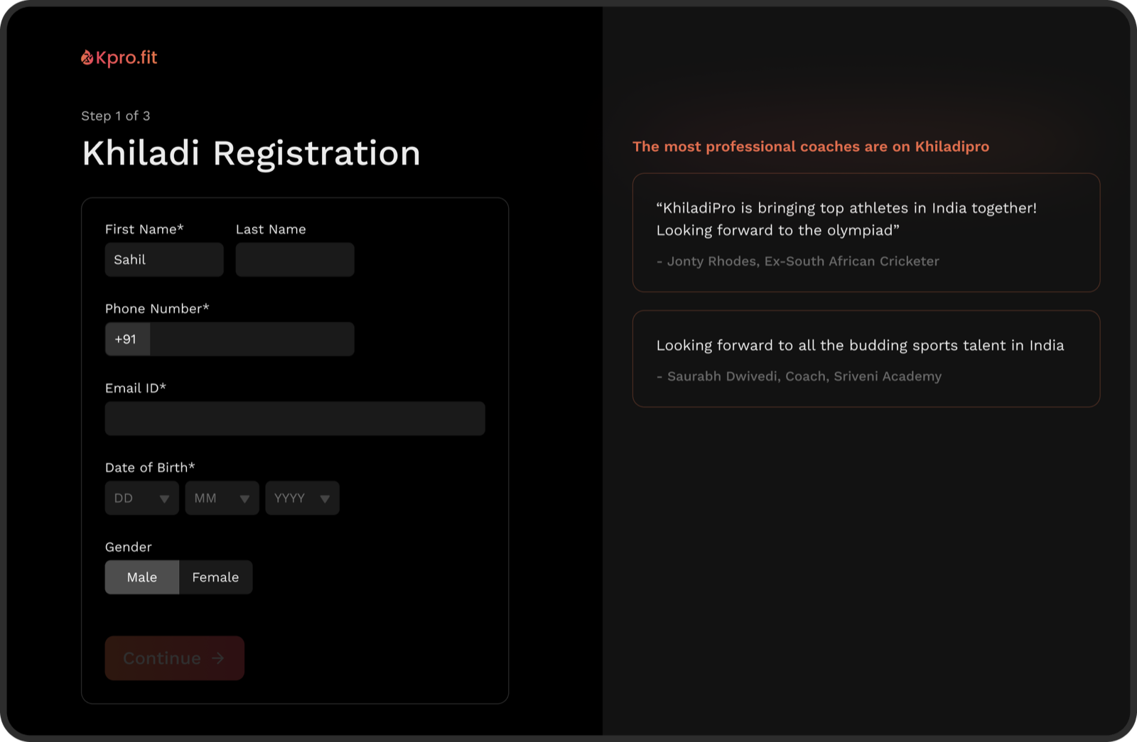
- C-04Persuasion before install. Registration and payment happen on the web, before the app is ever downloaded: the landing page had to carry the entire sell.
- C-05A team of four. Me, one product manager, one engineer, and the CEO. No other designers.
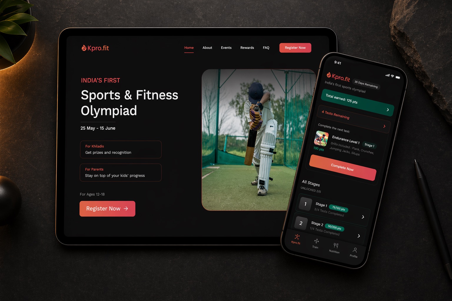
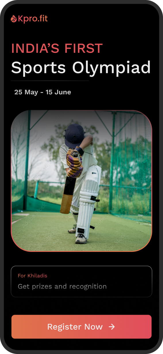
One page, three audiences
A 14-year-old wants prizes and recognition. Their parent, who holds the credit card, wants legitimacy and oversight. An academy wants credibility in front of its students. The landing page had to make all three promises without splitting into three pages.
The parent pays before the app is even installed, so the landing page has to do all of the convincing.
That funnel shaped the page: audience-specific value cards near the top (“For Khiladis”, “For Parents”), the age band stated plainly next to the CTA so unqualified visitors self-select out before clicking, and the event dates given hero billing: for a time-boxed event, urgency is the honest sell.
Process: the page went through three fidelity passes, each answering a different question: a low-fidelity pass to agree on structure and content before any pixels, a mid-fidelity pass to lock the layout, and the high-fidelity polish above. The first two are still up: lo-fi prototype → · mid-fi prototype →
Teaching a phone to watch you
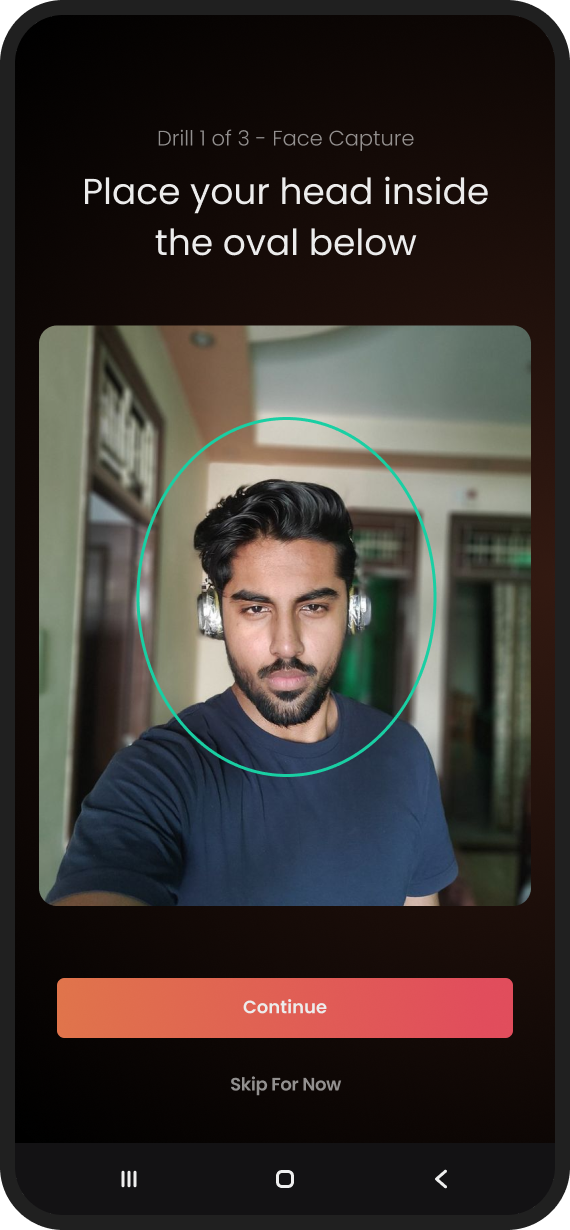
The first session is where this product lives or dies. A first-time user, often a 13-year-old, unsupervised, has to prop their phone against a wall, grant camera access, walk three metres away, and trust that an AI is counting their reps fairly. If setup fails, the drill can’t be scored; for a paid event, that’s a refund request. The onboarding flow was designed around that single failure mode.
Step 01
Show the magic before asking for anything
New users arrive from olympiad ads with zero context. A short video explains what the Supervision AI actually does, before the app requests a single permission.
Step 02
The exit is a feature
The entire tour is skippable from the start. Users who arrived organically and already know the drill are never held hostage by a tutorial built for strangers.
Step 03
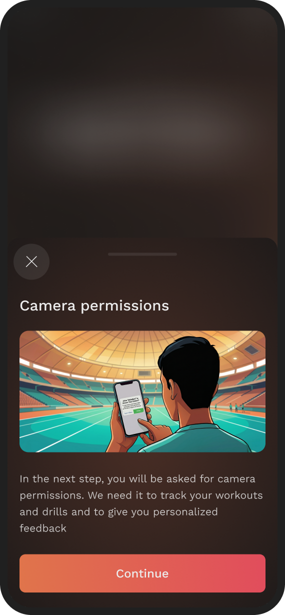
Earn the camera permission
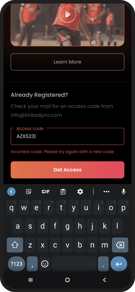
The OS permission dialog is preceded by a plain-language rationale: why the camera, what it sees, what it’s used for. In an app aimed at minors, a refusal here is fatal: nothing can be scored without it.
Step 04
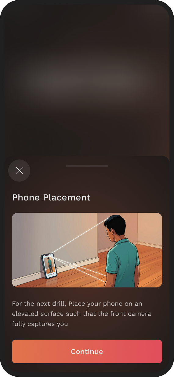
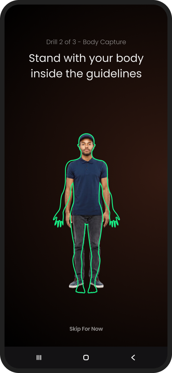
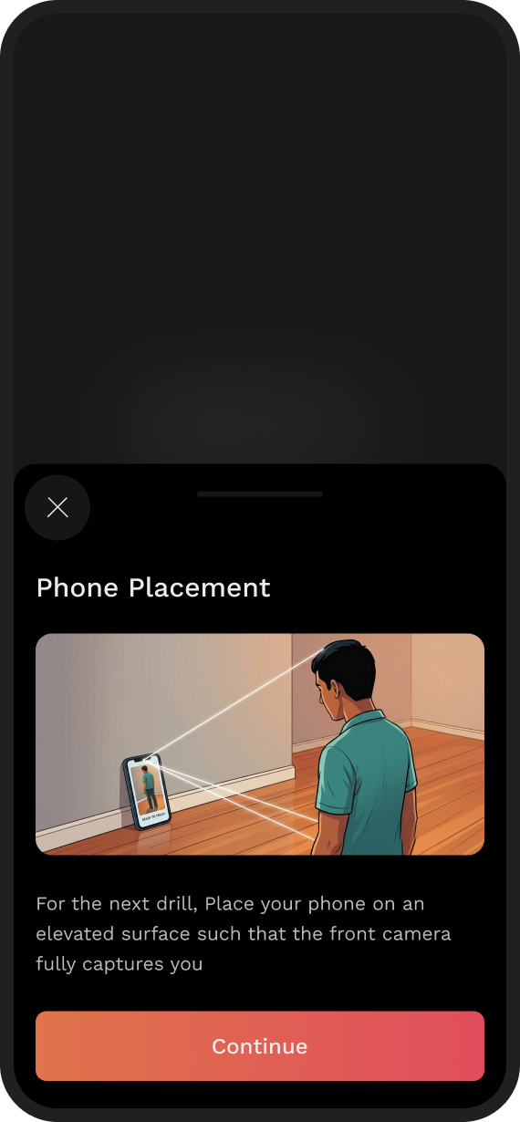
Show placement, don’t describe it
Correct phone placement is the make-or-break moment of the whole product. Text instructions fail at this; an illustration of a real room, phone propped up, full body in frame, succeeds.
Step 05
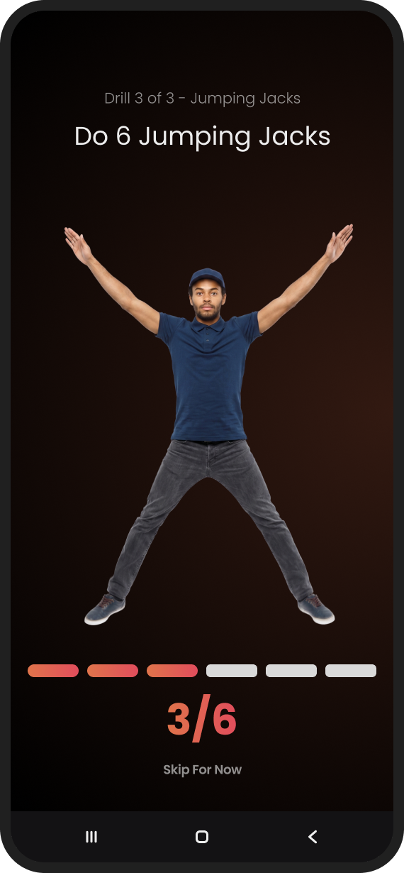
Rehearse before it counts
The flow introduces the visual AI through a simple practice drill, so the user’s first scored attempt is never also their first attempt.
Once the user walks away from the phone, tap targets stop mattering: type size is everything.
Step 06
Design for three metres
During a drill the user is across the room. Prompts and rep counters are sized to be read at that distance, an accessibility constraint most mobile design never has to think about.

Step 07
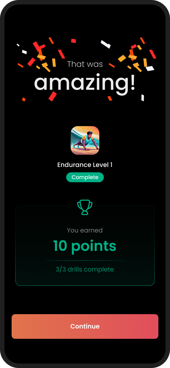
End on a high
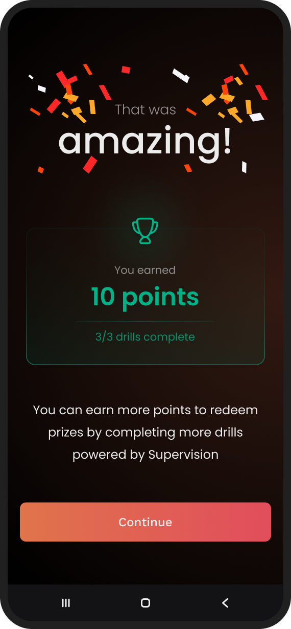
The flow closes with a celebration: the peak-end rule, applied deliberately. The last memory of setup is a win, not a permissions dialog.
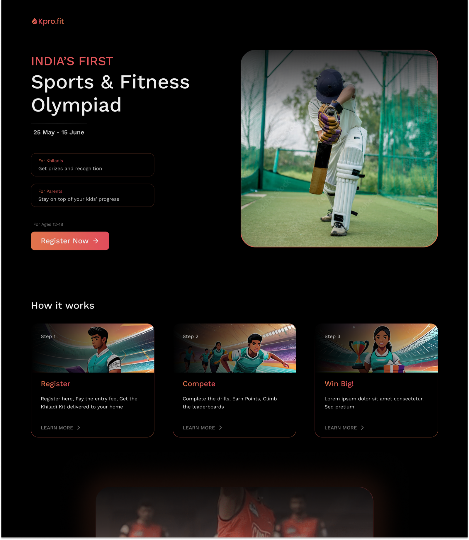
The olympiad, live
The app screens had to look native to Khiladipro’s existing product: an inherited design language, no design system, a little wiggle room. The interesting work here wasn’t the happy path; it was the states.
Before the event
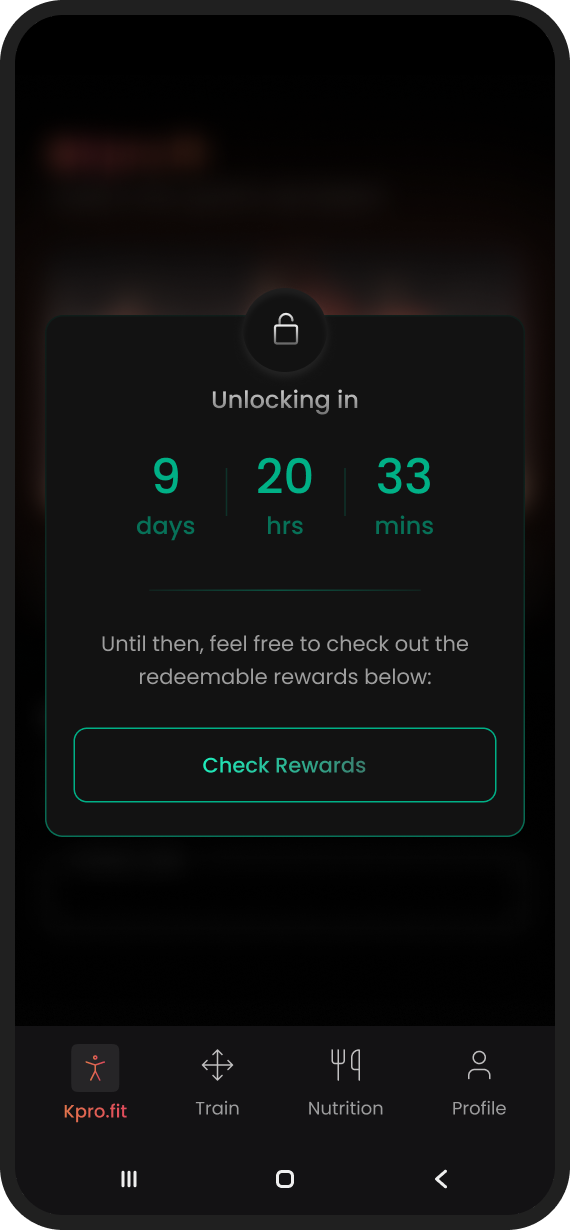
An event app spends most of its life waiting. Instead of a countdown and a spinner, the pre-olympiad states carry real information: what you’ve registered for, what happens next, what you can win.
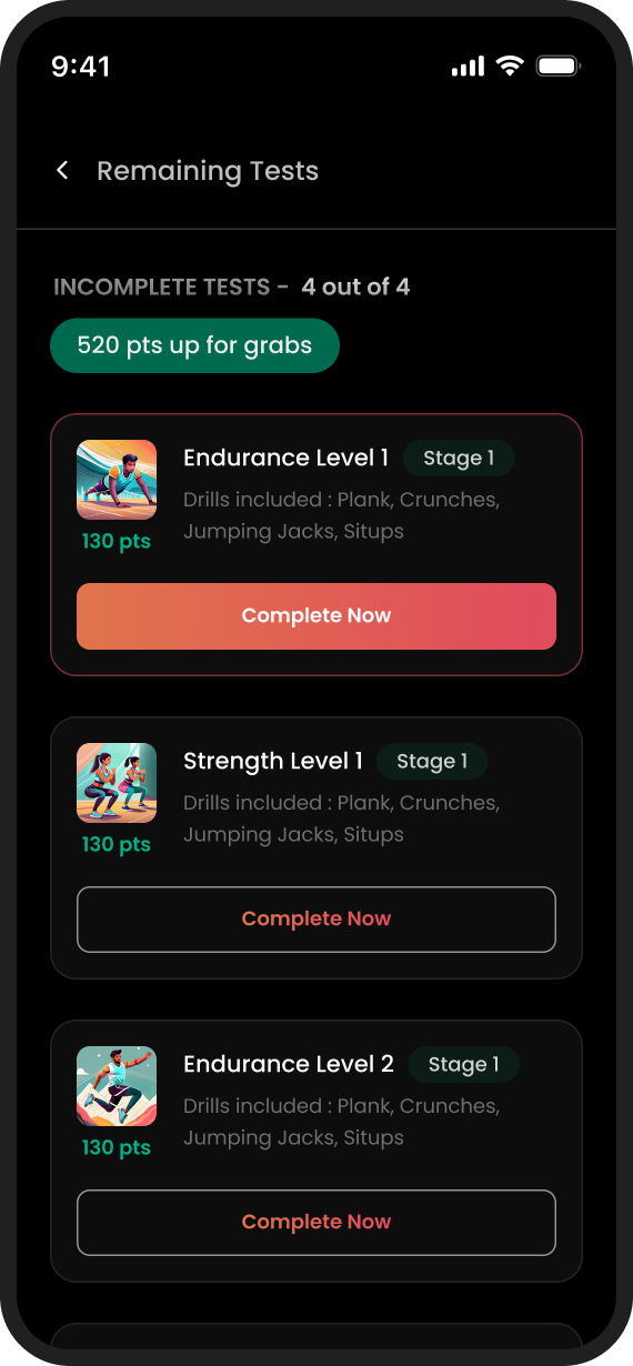
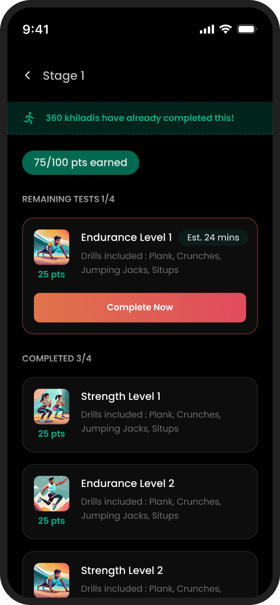
During the event
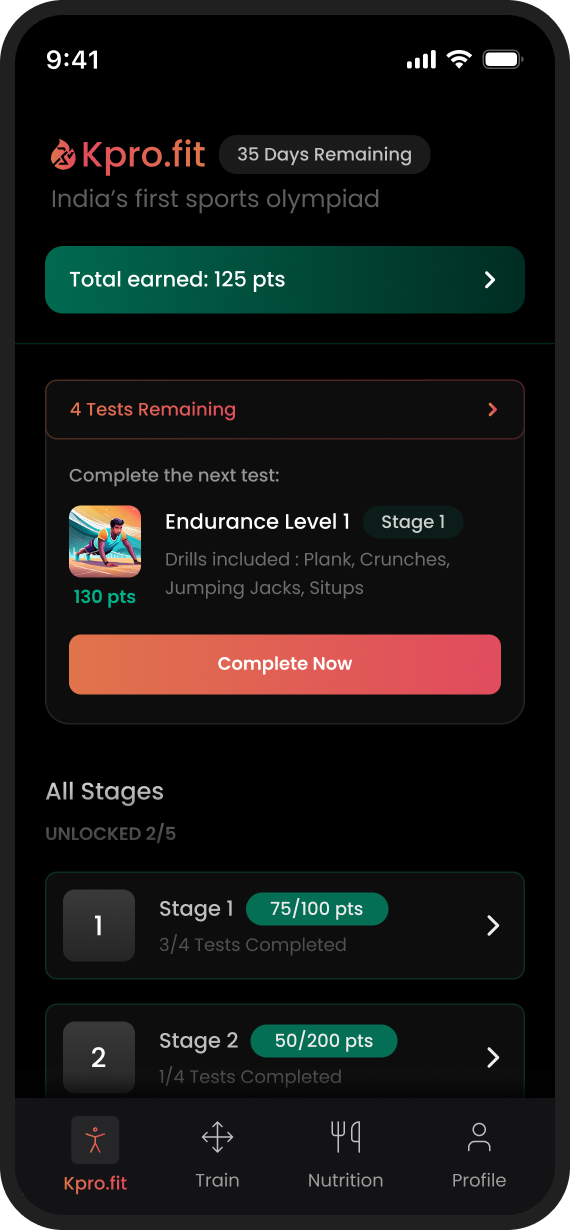
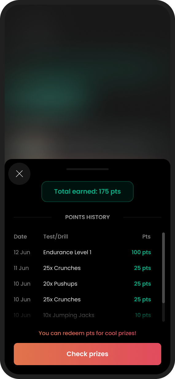
Once the olympiad opens, the loop is daily: open the app, check your points, do the remaining tests. The home screen leads with the two things a competing kid actually cares about: total points and the next test, and bottom sheets keep every detail one tap away without losing context.
The rehireRehiredA good sign, they came back
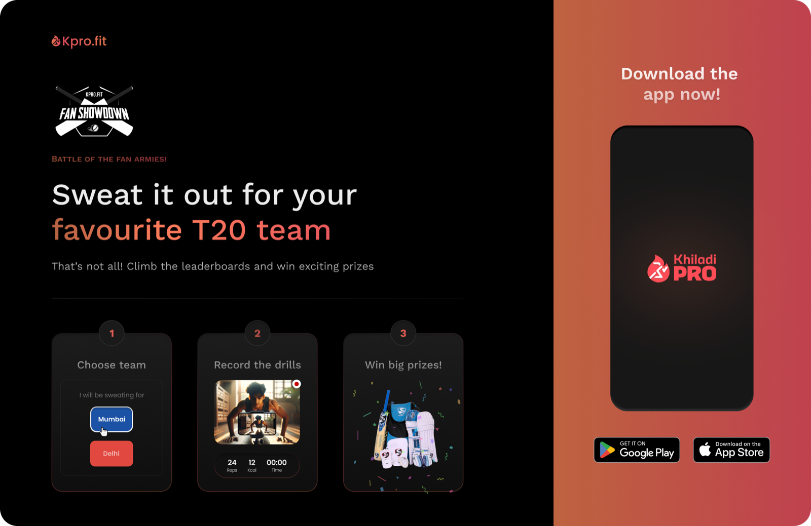
After the olympiad shipped, Khiladipro’s growth team came back with a second brief: a landing page for a fan campaign timed to the IPL, the world’s biggest cricket league. Their in-house team designed the app screens; I designed the page, desktop and mobile.
A rehire is the one outcome metric I can publish.
An honest scorecard
This was an execution engagement: the client owned the analytics, and I never had access to them. Rather than decorate the ending with numbers I can’t stand behind, here is what shipped, what I would have measured, and what I’d do differently.
Shipped
- 2 landing pages: responsive, desktop & mobile
- Web registration & payment flow
- First-run mobile onboarding
- Olympiad app flows: pre-event, live, error & waiting states
- ~8 weeks, sole designer
What I’d measure
- Landing → paid registration conversion, split by audience
- Onboarding completion, and the exact drop-off step
- Setup-failure rate on the first scored drill
- Daily return rate through the event window
- Share of drill submissions flagged unscoreable
What I’d do differently
- Comprehension-test the onboarding with actual 12-year-olds, not adults
- Negotiate analytics access into the engagement, not after it
- Revisit the binary gender field on registration
- Design the poor-network and failed-upload states for drill videos
Priyank is a talented designer with great skills. He showed intuitive product thinking. He is very proactive with his contributions and gives a lot of attention to detail. Working with him was a pleasure. I highly recommend him.
Fin.